babbly
-
product design & branding
2019-2020
Babbly is a Voice-AI platform that is building the world's largest data platform to track and support development in the first 1000 days of life. Through its smart speech tracker, parents can analyze their baby's voice and get personalized activities that help promote speech and language development. It's an app for any new or soon to be new parents, or anyone who has concerns about their baby's speech development
I was first brought to the project for conceptual web app mockups and branding; from there, I designed the logo and and visual identity for the app, along with all design systems and libraries. After that I took on the product design role to further designed and developed the app.
Product website Babbly.co
Lead product designer: Nikki Shih
Product owner: Maryam Nabavi
Beta version
The original idea of this app is very simple and straightforward, we want an app that tracks a baby's speech development, by doing so, a user uploads (or records on spot) an audio or video file to the app, our voice ai technology would then analyse the audio and output a report that shows the baby's speech information. The information included some key speech milestones in speech & language development, which are Cooing, Single Syllable Babbling, Duplicated Babbling, and Variegated Babbling.
This version only has 3 main focuses: speech tracker, milestones, and speech development information. This version of the app was done on a web platform within a lower budget, we sent out invites to parents who are interested in trying as a first round of testers and users. At the same time we conducted ethnographic research.
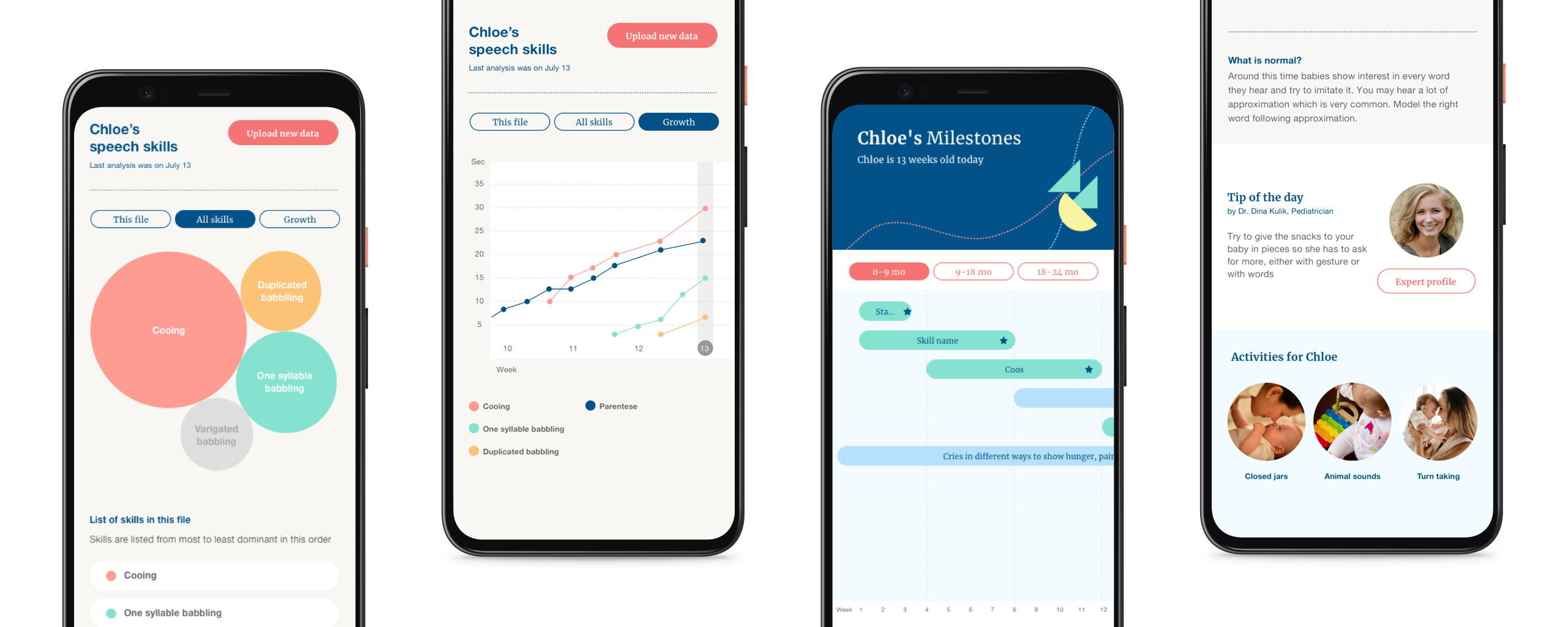
The bubbles
The main UI for this app is information graphics, the data we gathered is quantitative, but we didn't want to present numbers in the chart as it's rather meaningless to users. We used bubbles to show the level of each milestone, this way, users can have a general idea of how each milestone is developed based on its size in relation to other milestones
Challenge
After several rounds of testing, and the results from ethnographic research, the biggest challenge we had was that most parents didn't know what the result was, they understand what the chart was telling them, but they didn't know what it meant to them, whether or not their babies were having speech delay was still very vague for them. Our approach to keep the answers rather vague to avoid any legal issues was creating more questions to our users
Final product
After our first round of research and data, we reorganized key focus areas in the app:
Tracking and analysis
Tracking has always been our focus, but we want to also address the results and analysis so parents have a better idea where their babies are at, and at which point they should consult a SLP for further diagnosis.
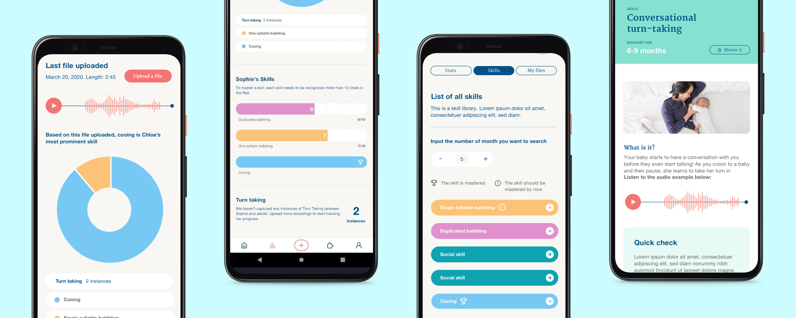
The report has two parts: the first one is the analysis of the file that's been uploaded, where we ditched the bubble graph, and replaced it with a traditional pie chart as each milestone is presented more accurately ; the second part is the baby's progress over time, each milestone needs to reach ten instances to be considered mastered. In this section we also included a skill library for educational purposes, where parents can learn the difference between each speech milestone by reading a written description and listening to audio examples.
Educational information
Most of the parents do not know anything about speech language development, the milestones we have sometimes means nothing to them, this app should also serve as a coaching program to help parents.
After the testing results from our beta version, we planned to embed our educational information throughout the app, and integrate it into our onboarding flow:
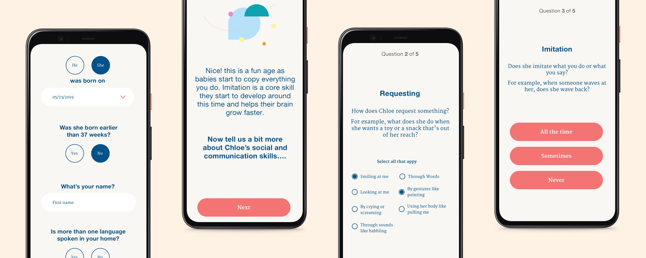
A user will start off with inputting personal information, then 5 benchmark questions for their babies. After that, we introduce the new users into each speech development milestone, and present a sample report so they become familiar with the type of information they will receive. After that, we direct them to the dashboard. each speech development milestone, and a sample report to showcase what they will be looking at, before directing them to the dashboard.
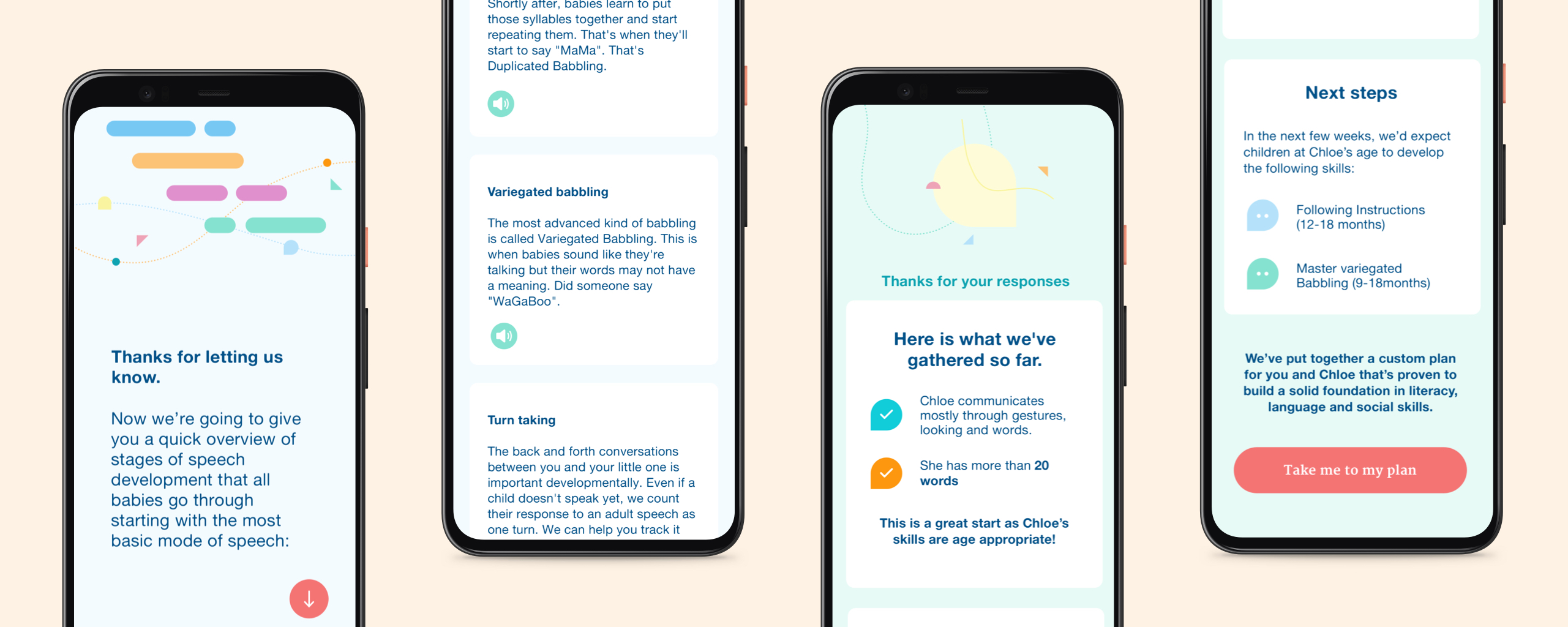
Dashboard and landing page reorganization
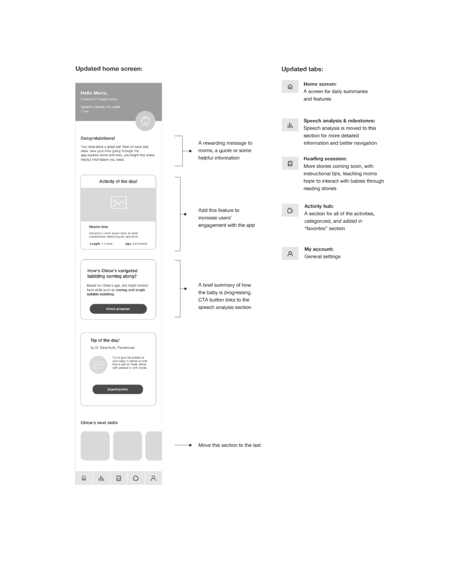
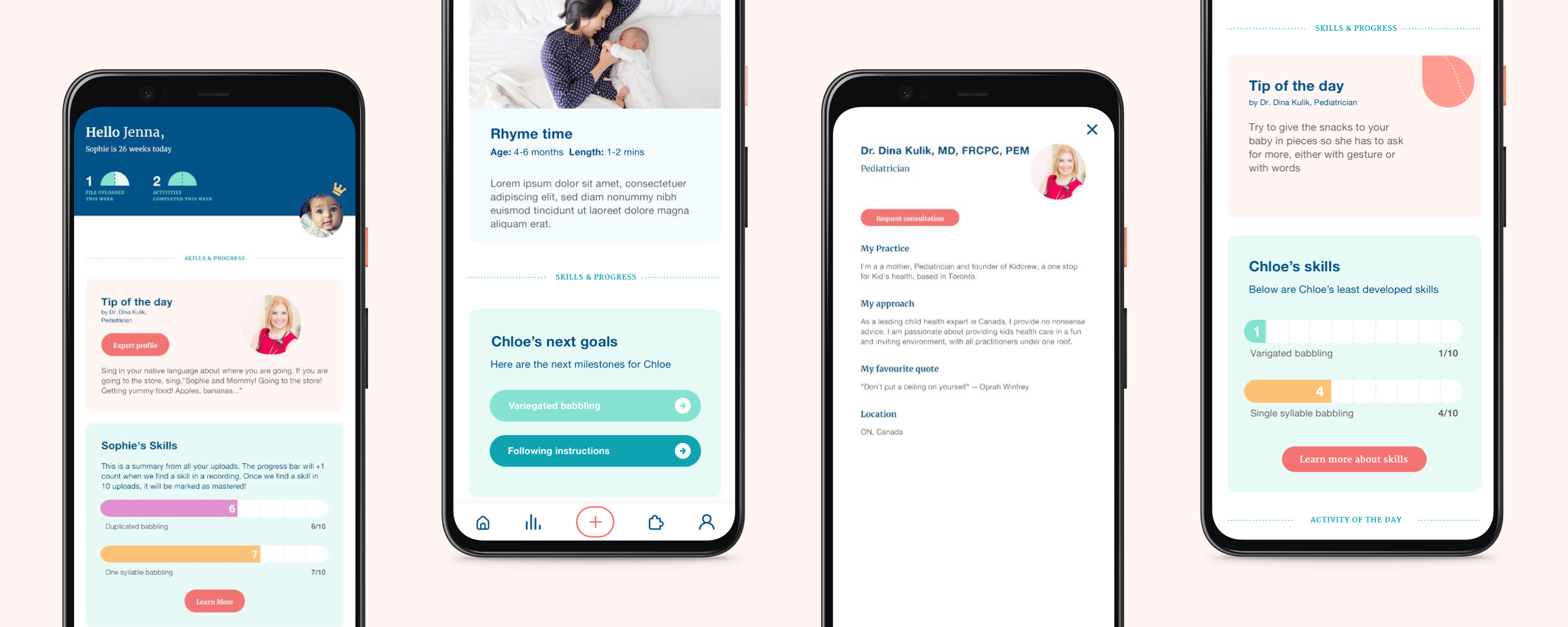
The landing page in our beta version didn't give much information to our users, after testing, we realized users are looking for more summarized information, tips, and clear instructions for next steps, so we decided to reorganize this area accordingly.
Activities
One of the concerns we have is how to increase returning rate, without a clear goal it's difficult to motivate parents to keep coming back and track their babies' speech development, parents are usually super busy, unless they're very concerned about their babies' speech delay, most likely this app will end up collecting dust in the corner of their app drawer.
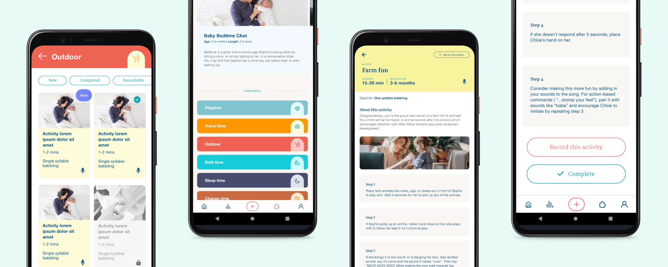
Our Speech Language Pathologists designed some bite-sized activities that are perfect to be integrated into the app; with built-in recording, parents can record while practicing with their babies, and the app will analyze and generate results on the spot, this will then be added to their babies' milestones.