CIBC
-
design system
2019-2021
In 2019, I was brought to the Tetris team in CIBC. For the past 2 years, we worked on creating a design system and framework for the new CIBC brand within the digital realm. The team is under public, and is responsible for a design system that works across all teams, and is compatible with the content management system - Adobe Experience Manager (AEM).
Role: Product Design Lead

Challenge
CIBC is an organization that has hundreds of designers working on different teams, digital and non-digital, creating a large design system that works for all teams is the biggest challenge. This design system focuses on our digital public team, the system is created based on design patterns across all teams, and is aligned with our AEM component design.
Basic elements: grid, typography, colours
These three basic elements are designed and tested on different platforms, and are developed in AEM template as roots for other design components.
Colours
Primary and secondary colours are provided by the branding agency that designed our new brand, those colours are used across main brand and sub-brands, with minor tweaks to represent each sub-brand's uniqueness. Other colours especially the different greys are tested when applying to text styles, we modified the branded charcoal grey to a darker tone for readability. When designing each component, colour combinations are tested for accessibility compliance.

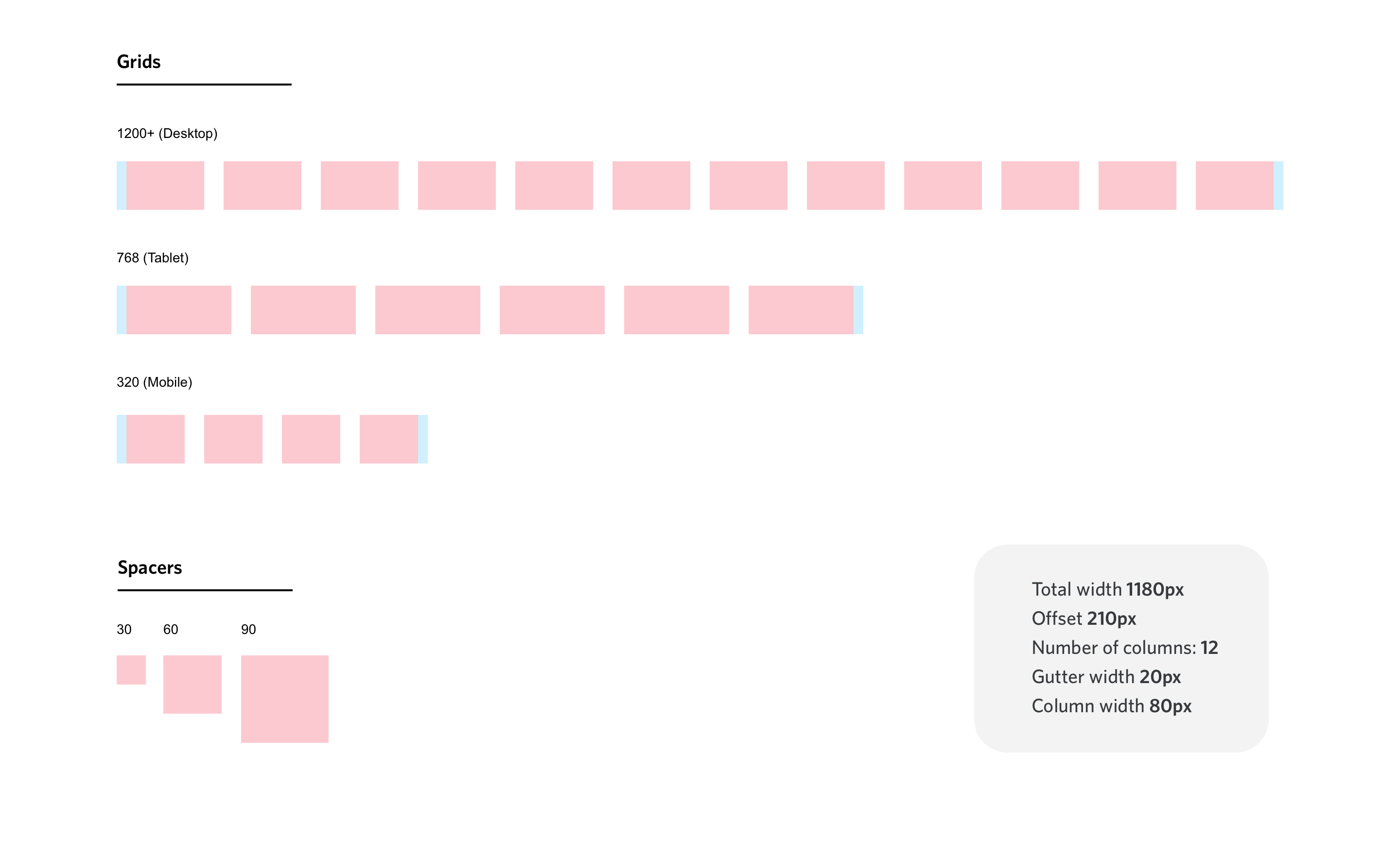
Grid
The responsive grid is the backbone of our AEM template. Many components and AEM features are designed based on the grid structure, following the nature of AEM authoring, some features including defining layout splits, pushing and pulling columns, and offsets, are all extensions of our grid system.
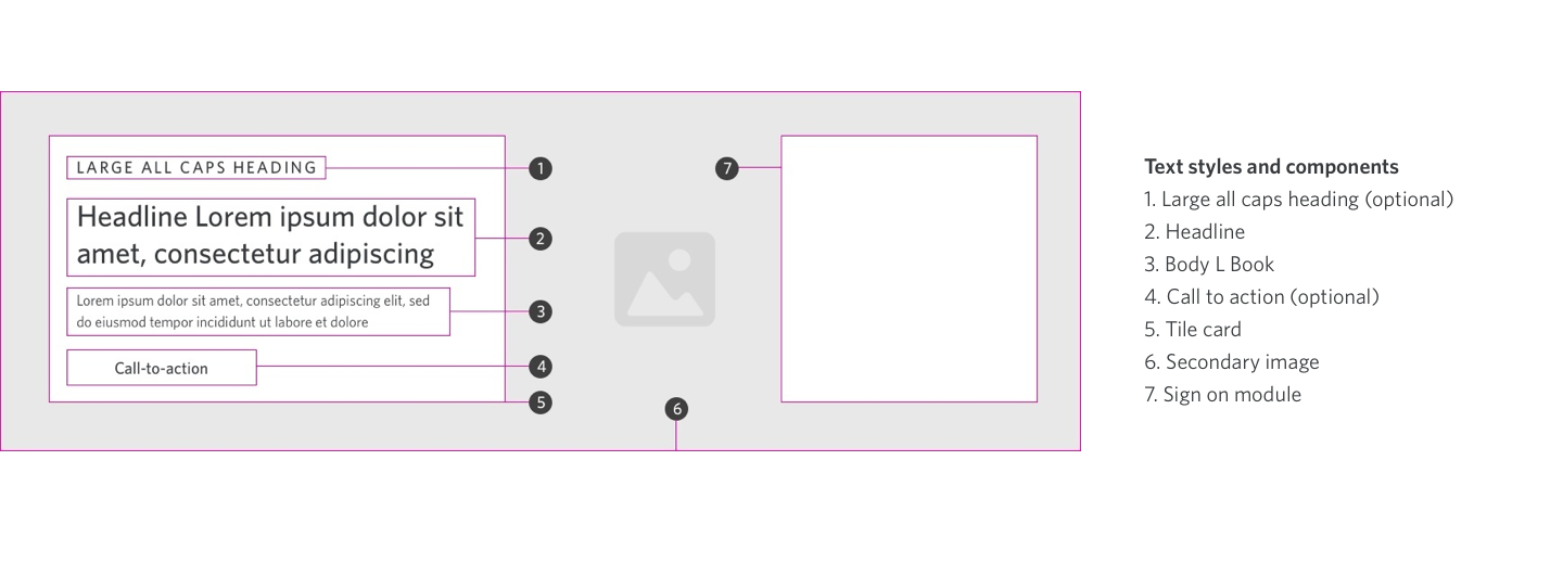
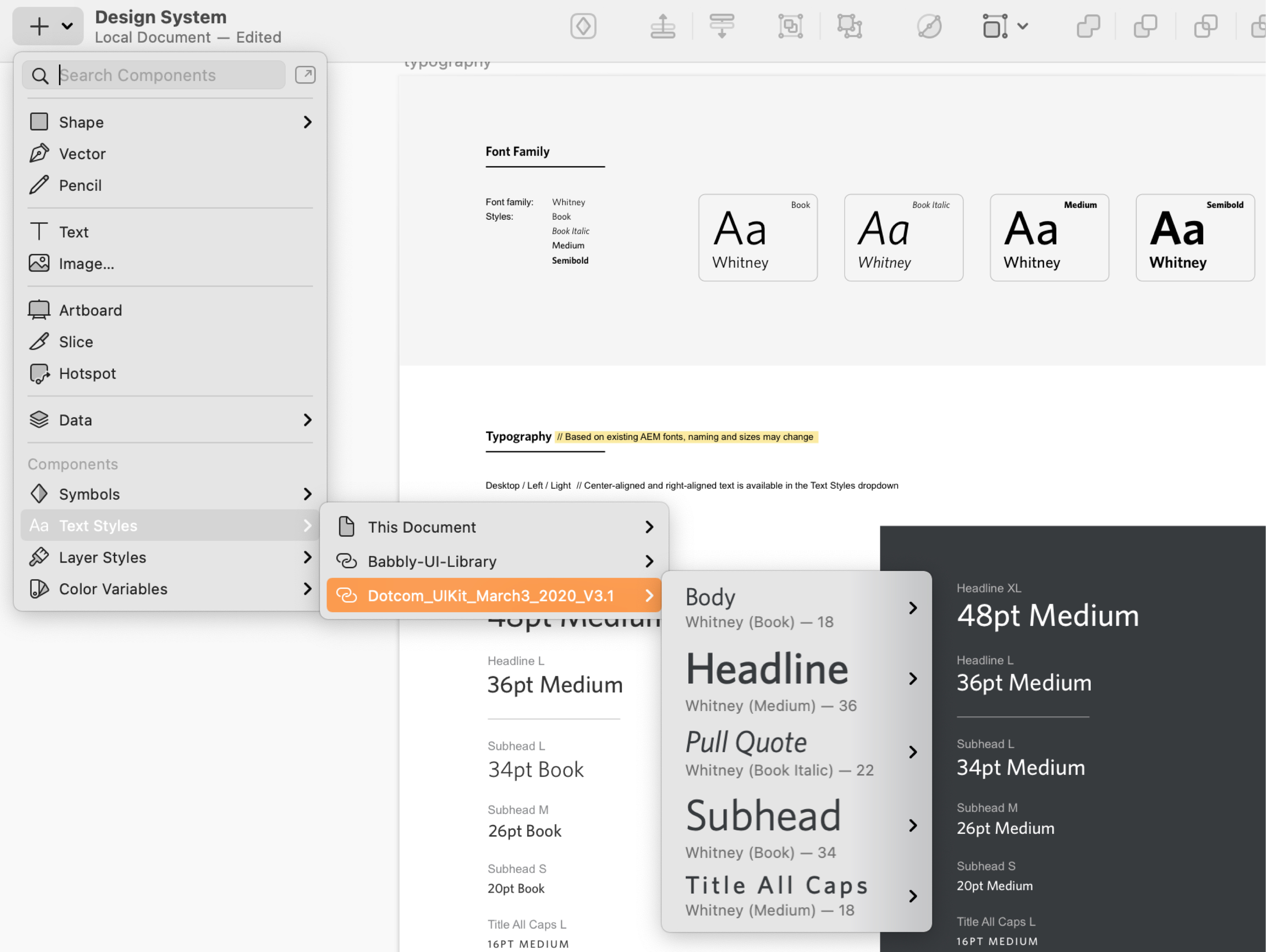
Typography
Text styles are designed for AEM authoring. Our team researched and created prototypes to define each typographic style, when the styles are developed and tested, designers only follow our typography guidelines to choose each corresponding style when designing and authoring.
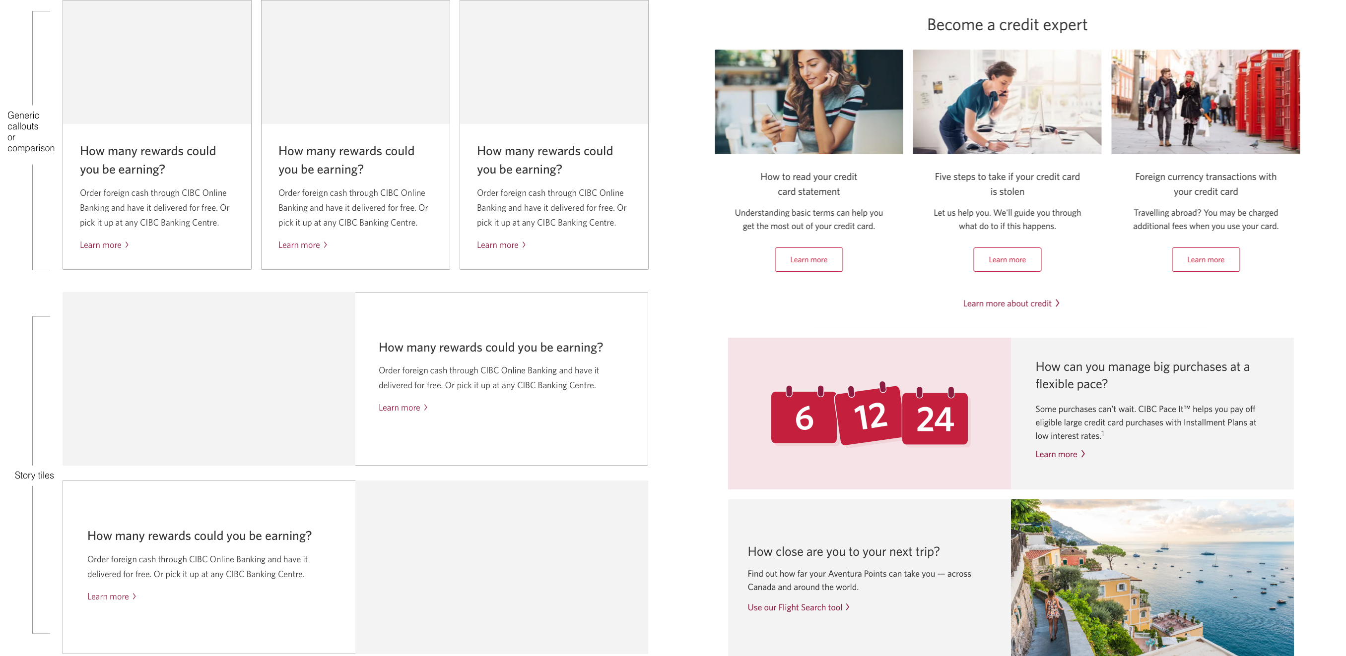
Callouts
Callouts are used extensively throughout the sites, in different variations. We have two main callout styles; one for vertically comparing different products, or for listing content in side-by-side callouts for better organization. Another type of callout is story tiles, for creating continuous content, or a series of offers and features, the orientation for that type of callouts is horizontal.
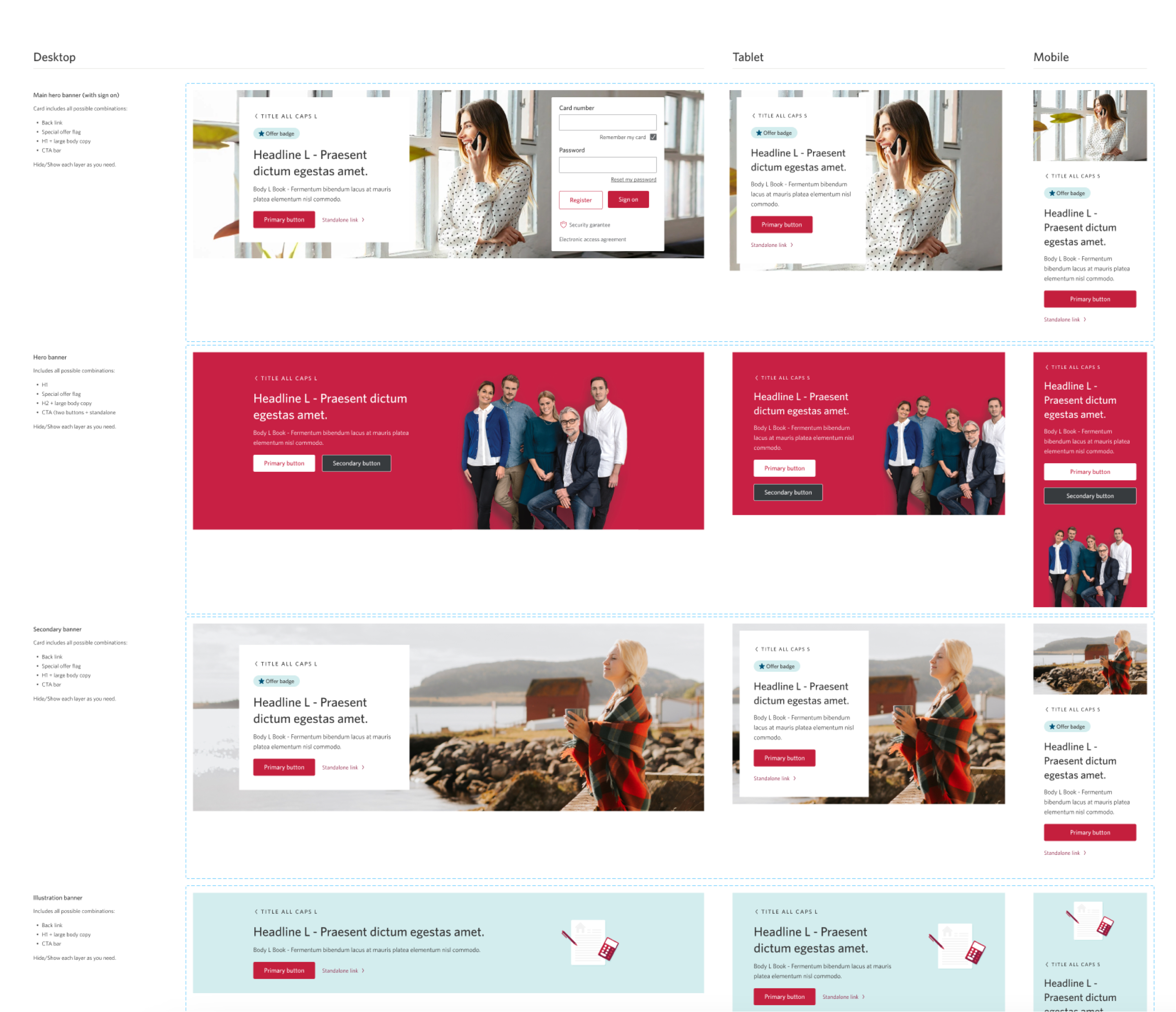
Banners
Banners are also challenging to manage. Our team designed a set of preliminary styles and guidelines for the new brand, later on more variations were created by other teams to fulfill their design requirements. We were able to research, consolidate, and create guidelines to the usage of different variations.
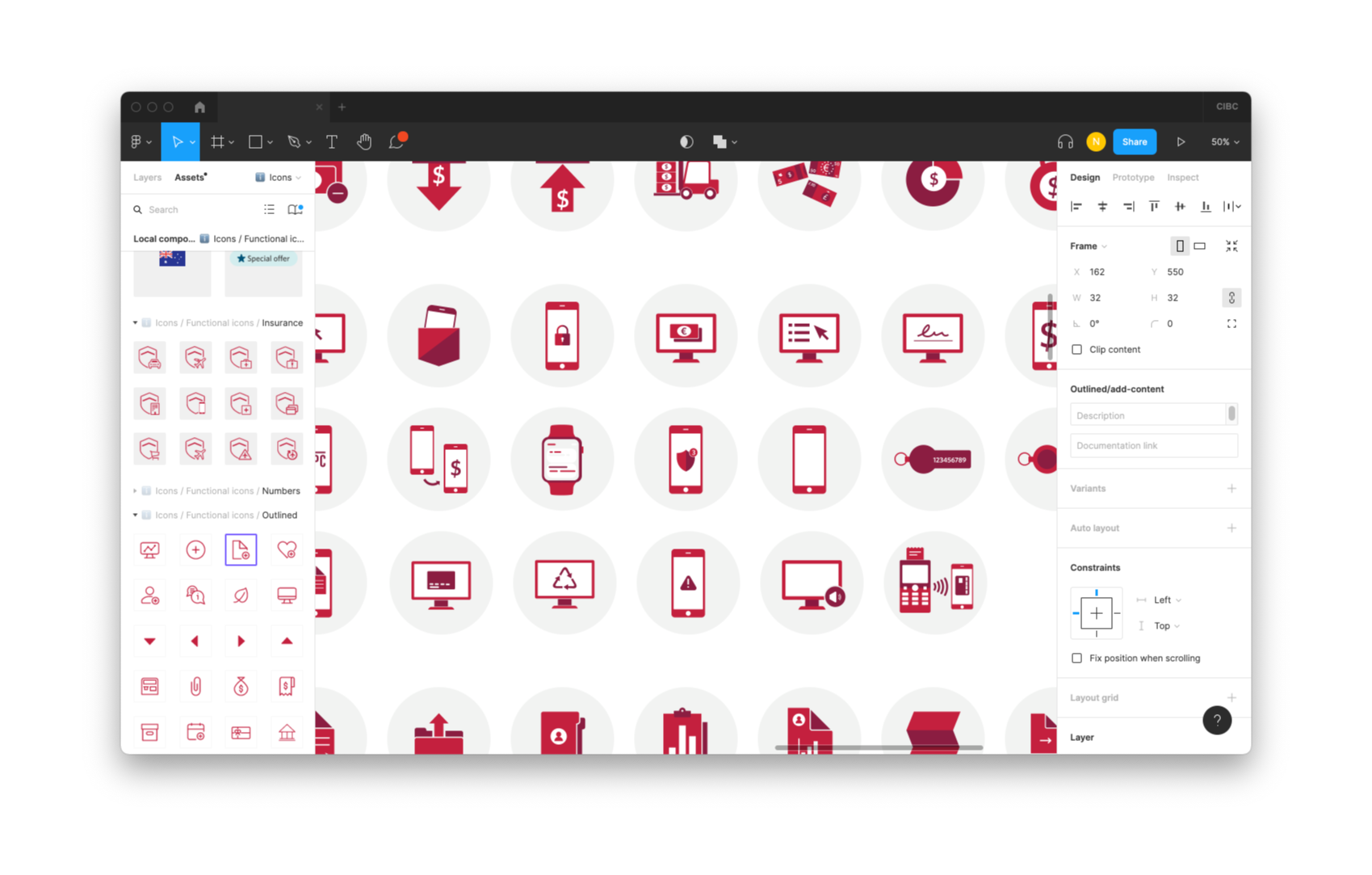
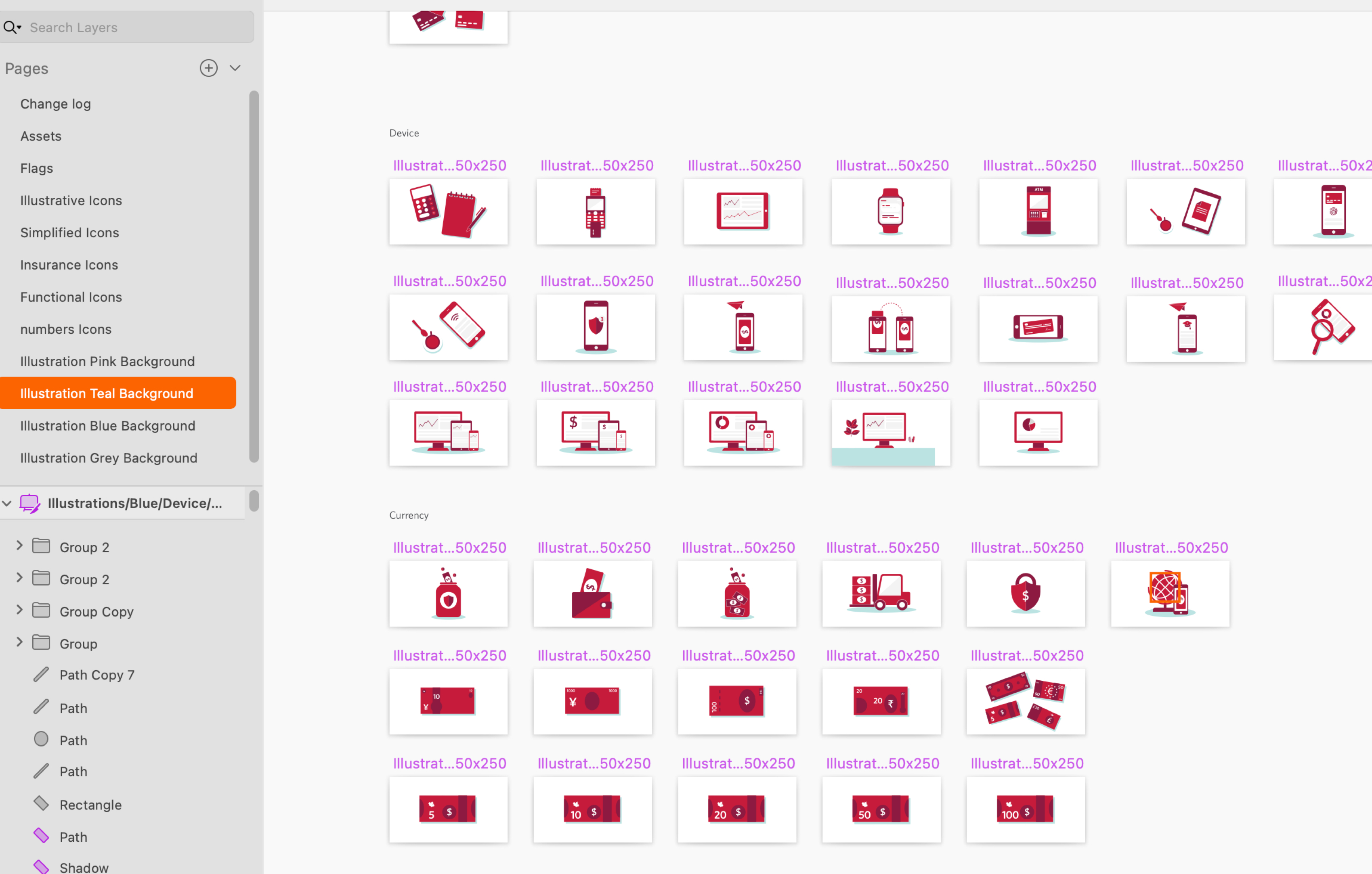
Icons and illustrations
Another two items that get messy easily in a large organization with so many designers. For icons we had a few different types, some are for more strict functional use, and are not allowed to upload to AEM freely, but guidelines and approval process are provided. Other types of icons are more for generic use, designers can pick from the library, or contribute new ones to it, as long as brand rules are followed.
Other components
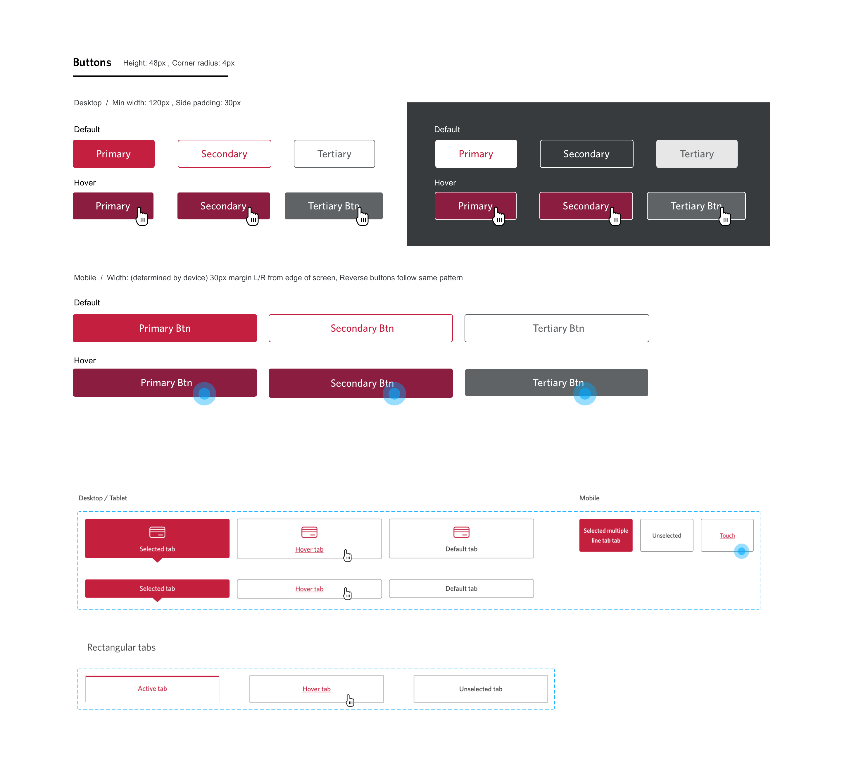
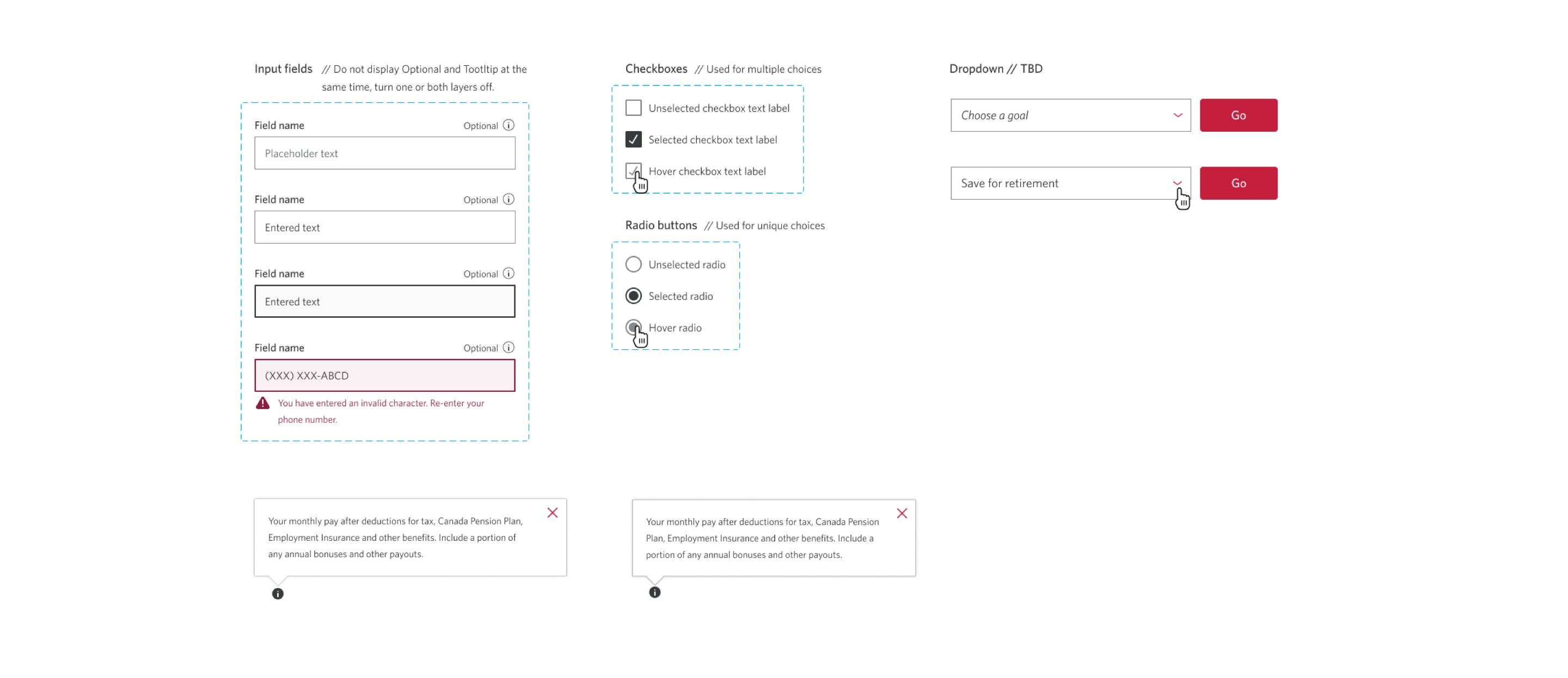
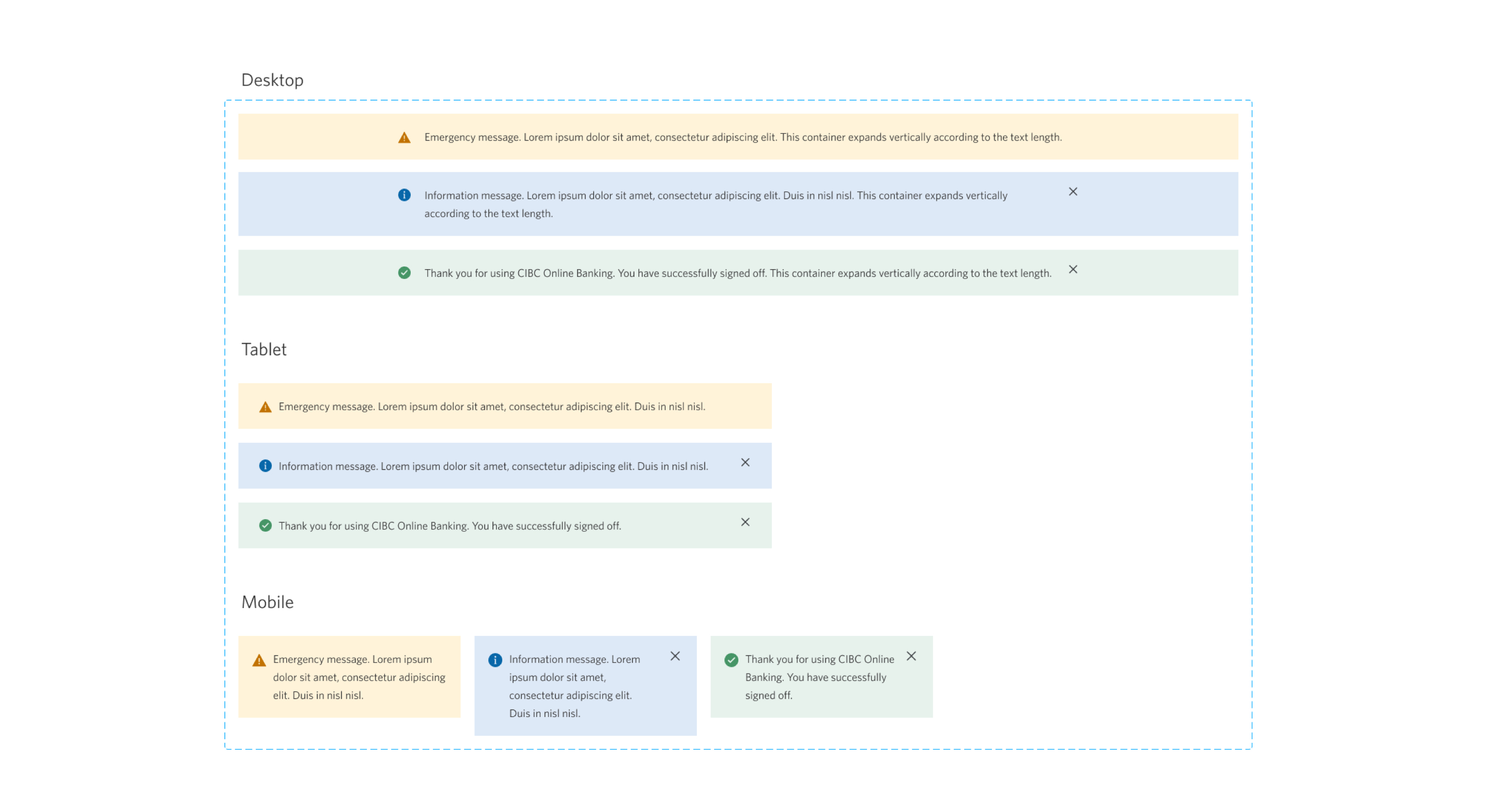
This section listed more, but not all, of the other components we use, such as buttons, links, tabs, forms, and warning messages. All of these components were created in both our design library for Figma and Sketch, and styled the same way in our CMS system - AEM.